
Published February 2015
Access Denied
Barriers to Online Voter Registration
for Citizens with Disabilities
The Center for Accessible Technology
Published January 2015
Written by Susan Mizner and Eric Smith
Additional contributors: The Center for Accessible Technology, Eunice Rho, Diana Scholl, Claudia Center
THE AMERICAN CIVIL LIBERTIES UNION is a nationwide, nonprofit, nonpartisan organization dedicated to the principles of liberty and equality embodied in the U.S. Constitution and the laws of the United States.
AMERICAN CIVIL LIBERTIES UNION OFFICERS AND DIRECTORS
Susan N. Herman, President
ANTHONY D. ROMERO, Executive Director
Gary Williams, Vice President
Robert Remar, Vice President, Secretary, Treasurer
Philippa Strum, Secretary
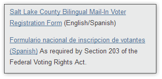
Contents
The Importance of Accessible Online Voter Registration 6
Common Online Barriers for People with Disabilities 8
1. Inaccessible Forms and Screen Reader Access 21
2. Failure to Use Accessible Coding Language 22
4. Alt (Alternative) Text for Images 28
Appendix A: Web Accessibility Glossary 52
Appendix B: States with Online Voter Registration 56
Appendix C: Recommended Evaluation Criteria 58
Executive Summary
There is growing consensus on the many advantages of online voter registration.1 For election officials, the online efficiencies translate into reduced administrative burdens, increased accuracy of data, and potentially millions of dollars in cost savings.2 For eligible voters, an online voter registration system is quick, convenient, and accurate. Perhaps most importantly, according to the Social Science Research Council, “while about 51 million eligible adults, or about one in four U.S. citizens, are not registered to vote,3 the evidence is clear that online voter registration is helping to increase voter franchise and build a more robust and vibrant democracy.”4
This report focuses on one urgent issue: the accessibility of online voter registration websites for voters with disabilities.
There are two reasons that online voter registration sites must be accessible:
1. It is a good idea: People with disabilities constitute 19 percent of eligible voters.5 Those most likely to experience barriers online are people with visual disabilities, cognitive disabilities (such as traumatic brain injury), learning disabilities, and limited mobility of arms and hands. For many, online registration would remove the need for a time-consuming and burdensome trip to the Department of Motor Vehicles.
2. It is the law: Title II of the Americans with Disabilities Act (ADA) requires all state and local government entities to ensure that people with disabilities have equal access to government programs and services. The ADA also requires equally effective communication.6 An online voter registration system is such a program and service, and the information it communicates must be equally available to people with disabilities.
So, what is an accessible website? An accessible website is one that allows all users to access its information, navigate with ease, and interact as needed. For example, an accessible website accomplishes the following:
The ACLU partnered with the Center for Accessible Technology, nationally recognized experts on website accessibility standards and assistive technology for people with disabilities, to assess the accessibility of online voter registration websites. The Center for Accessible Technology briefly evaluated disability access for all 20 states that offered online registration in May 2014,7 and it conducted more in-depth reviews of California, Kansas, Minnesota, Missouri, Ohio, and Utah’s sites.8
The results? There’s bad news and good news:
The bad news: Only one online voter registration site in the country—California’s—is fully accessible to people with disabilities, and most state sites do not meet even minimal standards of accessibility.
The good news: The changes needed to make most voter registration websites accessible are both inexpensive and relatively straightforward. Furthermore, the steps needed to make websites accessible to people with disabilities tend to improve the user experience for everyone.
This report lists the most common problems, ranging from issues that completely bar a user with a disability from being able to access the site to issues that pose significant hurdles to use.
Of the common problems, these are the most serious:
1. Inaccessible forms
On all but one of the state sites reviewed, the most important portion of the website—the online voter registration form itself—was inaccessible to people who use screen readers. (Screen readers are a simple technology that translates text to speech for people with visual disabilities, dyslexia, or other cognitive disabilities.) Because the forms were not properly coded, people who use screen readers would find it difficult or even impossible to know if information such as their name or address was entered into the proper fields.
2. Poor navigation between pages on the website
All but the California and Utah websites were structured in a way that makes it burdensome and confusing to navigate with a screen reader. Proper coding allows a user to move between screens without getting lost or confused in the process.
3. Inaccessible images
People who are blind or low vision cannot view an image on a site. They rely on coding (called alternative text, or “alt text”) that explains what an image is. The majority of sites either did not provide this information or provided it incorrectly.
4. Poor website design
Some states designed their sites in ways that created obstacles for both users with and without disabilities. These design flaws include using insufficient contrast between text and background color, using small text that fails to enlarge clearly, and using sophisticated and complicated language where simple sentences would do.
This report is a tool for election officials and computer programmers to design accessible voter registration websites. It details common errors in online voter registration sites and highlights best practices for website designers. It includes both basic information for the lay reader and detailed instructions for the expert coder.
Making websites accessible will improve the voting process for everyone. Moreover, at least one study has shown that making websites accessible will enable states to save money.9 By implementing the recommendations included in this report, states and localities will ensure that all eligible voters will have the opportunity to participate in our democracy without unnecessary barriers.
The Importance of Accessible Online Voter Registration
Historically, people with disabilities have faced enormous barriers to exercising their right to vote. Inaccessible polling locations and voting machines—as well as wholesale disenfranchisement of people with certain types of disabilities—have discouraged, and at times prevented, many citizens with disabilities from participating fully in the voting process.
The Help America Vote Act (HAVA) of 2002 moved the United States a giant step forward in removing barriers to the vote. With the requirement of accessible polling places and accessible voting machines, HAVA promised full access to the ballot for people who had previously been unable to vote privately and independently. The ADA has also established the clear right of people with disabilities to equal access—especially equal access to government services. Title II of the ADA requires state and local government entities to ensure that people with disabilities have an equal opportunity to participate in or benefit from all government programs, activities, and services. To fulfill this mandate, governments may need to make reasonable modifications to policies, practices, or procedures, or provide auxiliary aids and services.
In short, state and local governments must ensure they are not creating barriers—even unintentional ones—for people with disabilities.
The Internet plays a central role in connecting Americans to information, government services, and opportunities for civic engagement. Just as physical accessibility means that people with disabilities can reach a sidewalk using a curb ramp or enter a building with an automatic door opener, web accessibility ensures that people with disabilities can perceive, understand, navigate, and interact with digital information.
As more of the political process moves online, state governments need to ensure that people with disabilities are not left behind. When the web is accessible, many people with disabilities can communicate, interact, and participate online more easily than they can in the physical world. Online voter registration can, if done correctly, be an enormous service to many people with disabilities.
Common Online Barriers for People with Disabilities
About one in ten potential voters needs an accessible website. Barriers to the Internet are most frequent for the 8.1 million Americans who have difficulty seeing, the 6.7 million people who have difficulty grasping objects such as a mouse or typing on a keyboard, and the approximately 10.6 million adults who have some type of cognitive or learning disability.10
The spectrum of disability experiences is extremely broad. The following is an overview of some of the most common barriers people with disabilities experience in using the Internet. While not comprehensive, the review should provide a basic understanding of the usual ways people with disabilities can best access the web.
People with Visual Disabilities
People with visual disabilities are generally divided into two groups: those with limited vision (“low vision users”), and those with no vision (“blind users”). Both groups are legally blind, and both may use a computer with different types of assistive technology.
Low Vision Users
Most low vision users rely on enlarging the images and text on their computer monitor to see a website. To do this, one can set the print size to large or use screen magnification software. It is not uncommon for a low vision user to need to magnify the screen so that only one-sixth or one-eighth of a typical screen is visible at a time. Much of an enlarged screen is out of view, so a user must move the screen around to see all of the text. Setting the screen to this level can make the text readable, but it can be very disorienting and hard to navigate, with these users often “swimming” around the screen, trying to find key content.
Screen magnifier software makes the screen visible for people with low vision, but the screen can show only a portion of the webpage at a time.
Low vision users often encounter the following challenges when browsing the web:
Blind Users
Blind users generally access computers with screen reader software. Screen readers convert print on the screen into a spoken, synthesized voice. (Screen readers can also connect with machines that translate the text to Braille for those who read Braille, but a synthesized voice is more commonly used).
Screen reader software has the potential to allow a blind user access to everything on the web. However, it relies on the web designer to build the site in a way that the screen reader can “read” the information. Screen readers are extremely smart—but they are not “mind readers.” They can read text and code, but they cannot read images. So, for example, a screen reader cannot translate the contents of a photograph or a map. It cannot even read the words “Secretary of State” if they are part of an image and not text.
The header for the Minnesota Secretary of State’s webpage is an image. It includes Mark Ritchie’s photo, the state seal, and the words “Office of the Minnesota Secretary of State Mark Ritchie.” A screen reader cannot read the photo or the words in it. But it can read an “alt tag” describing the image in text so that the user understands the significance of the image (the “alt tag” is shown below in green).

Blind users face several important challenges when using the web:
A well-designed website uses a computer language called semantic HTML to provide quick keys to the structure of the page. For example:
People with Mobility Disabilities
People with upper-body mobility disabilities range from those who have mild difficulty with fine motor control, making the use of a mouse difficult, to those who have no use of their arms or hands at all. For many, using a keyboard and mouse presents a challenge.
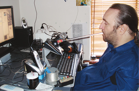
Some people with limited mobility in their upper body use mouth sticks to use a computer.
Many people with mobility disabilities use one or a combination of the following:
Basic aspects of accessible design for these users include minimizing the number of clicks needed to get to key information and organizing a site’s contents in a logical manner.
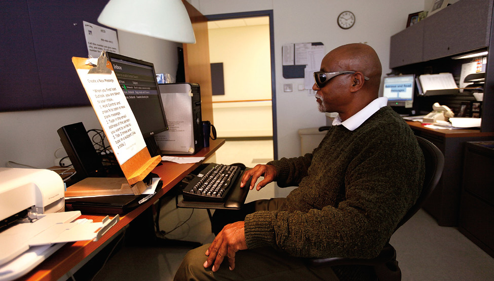
Speech recognition technology allows people with hand or upper-body limitations to use a computer through verbal commands. Here, Vernon Cox, who has had quadriplegia since childhood, uses speech recognition technology instead of the mouth-held typing stick he used in years past.

People with Cognitive or Learning Disabilities
People with cognitive or learning disabilities are the largest and most diverse group of people with disabilities who need access to the web. Such individuals may have difficulty processing written language, images, speech, or numbers.
Cognitive disabilities include autism, Down syndrome, traumatic brain injury, and dementia, while learning disabilities include attention deficit disorder, dyslexia, and dyscalculia (difficulty with numbers).
To access information on the web, people with a cognitive or learning disability may use several technologies at the same time. Someone who has difficulty reading may use a screen reader that highlights text plus synthesized speech to facilitate comprehension, while someone with an auditory processing disability may use captions to help understand an audio track.
This is an example of the use of a combination of illustrations, graphics, and text to communicate key ideas.11 Many people with cognitive or learning disabilities benefit from this approach.
Barriers that people with cognitive or learning disabilities encounter on websites include the following:
Other Groups Affected by Website Accessibility
Seniors, People with Limited English Proficiency, People with Limited Literacy
Many people who do not identify as having a disability are also affected by inaccessible website design, such as seniors, people with limited English proficiency, and people with limited literacy.
For all audiences, the Center for Accessible Technology recommends the following:
A website that is well designed for people with disabilities will be a website that is easier to use for everyone. A well-designed website is an accessible website.
Report Card
Overview
At the ACLU’s request, the Center for Accessible Technology (CforAT) conducted a review of online voter registration sites in May and June 2014. The goal was to gauge the accessibility of these websites for users with disabilities as well as to identify best practices where they existed. In evaluating websites, CforAT uses the Web Content Accessibility Guidelines (WCAG) 2.0, conformance level AA, as its baseline to assess accessibility, but it also conducts user testing with people who have a variety of disabilities so as to include real-life experience and interaction in its evaluations.12
This section of the report provides an overview of how the states fared.
CforAT briefly reviewed all 20 states that had online voter registration as of May 2014 and selected six states for a more in-depth review. These six states were:
Of these, California’s online voter registration site was the only one that passed all the tests. A brief look at the remaining 14 states with online voter registration showed similar access issues repeated over and over again.
The results of the review provide both good and bad news: The bad news is that state governments are, as a whole, doing an abysmal job of providing fully accessible voter registration websites to the public. The vast majority of states that have implemented online voter registration are inadvertently barring people with disabilities, and screen reader users in particular, from making use of this new approach to voter registration. Overall, the accessibility of online voter registration is quite poor, and virtually all of the websites that CforAT examined have significant barriers that would make the sites unusable for many people with disabilities.
The good news is that the majority of the access barriers are quite easy to correct. Most of these websites can be brought up to decent accessibility standards without great expense and within a fairly short period of time.
Most Common Access Issues
Of the six states that the Center for Accessible Technology reviewed in detail, the accessibility ranged from beautifully accessible (California) to extremely inaccessible (Missouri). With the exception of California, all the states failed the most basic form of accessibility: access for screen readers.
States routinely failed on “skip navigation,” which allows users relying on accessible technology to navigate a webpage quickly. Less frequently, but importantly, some states also had challenges with “text scaling.” This allows users to change the size of the text on the page and is especially important for low vision users. In particular, Missouri failed to provide a logical “tab order.” This refers to how the cursor moves when the user presses the tab key, and it is an especially important feature for users who cannot use a mouse.
The most troubling barrier, however, given the purpose of online registration sites, was the inaccessibility of the actual voter registration forms. State sites also had barriers to navigating through the site, understanding the images on the site, and being able to see the text clearly.
Table 1 below summarizes how each state fared for the access issues tested:
table 1
|
California |
Utah |
Minnesota |
Kansas |
Ohio |
Missouri |
|
|
Forms |
Pass |
Fail |
Fail |
Fail |
Fail |
Fail |
|
Screen reader access |
Pass |
Fail |
Fail |
Fail |
Fail |
Fail |
|
Semantic organization |
Pass |
Pass |
Fail |
Fail |
Fail |
Fail |
|
Skip navigation |
Pass |
Pass |
Fail |
Fail |
Fail |
Fail |
|
Alt text |
Pass |
Fail |
Pass |
Fail |
Fail |
Fail |
|
Keyboard access |
Pass |
Pass |
Pass |
Pass |
Fail |
Fail |
|
Contrast |
Pass |
Fail |
Pass |
Fail |
Pass |
Pass |
|
Text size and scaling |
Pass |
Pass |
Pass |
Pass |
Fail |
Fail |
|
Tab order |
Pass |
Pass |
Pass |
Pass |
Pass |
Fail |
Note: The access issues listed above are explained in greater detail in the following section, “Access Issues Explained.” Any state that failed the forms test automatically failed the screen reader test.
The Center for Accessible Technology also evaluated the sites for usability issues. These factors are less commonly considered as access issues, but they can make a big difference for people with cognitive or learning disabilities, seniors, people with limited literacy, and people with limited English.
The factors evaluated included the following:
The table below summarizes the results of the usability issues tested. Boxes coded in light blue scored well, while those in dark blue scored very well. Boxes in red scored poorly. White indicates a borderline score.
Table 2
|
California |
Utah |
Minnesota |
Kansas |
Ohio |
Missouri |
|
|
Site readability score |
52.1 |
37.4 |
46.1 |
45.1 |
49.3 |
52.7 |
|
Languages supported |
10 |
2 |
1 |
1 |
1 |
1 |
|
Email contact listed |
No |
Yes |
No |
No |
Yes |
Yes |
|
Alternate registration |
Yes |
No |
No |
Yes |
No |
No |
|
Phone number listed |
Yes |
Yes |
Yes |
Yes |
Yes |
No |
|
Accessibility statement |
Yes |
No |
No |
No |
Yes |
Yes |
Again, California modeled the best practices, with a high readability score, multiple languages, and options for users who may have encountered problems on the website.
Access Issues Explained
This section provides more detail on the most common access barriers for online voter registration. It is intended to be helpful to the lay person as well as to programmers and website designers. We have made every attempt to explain the issues in plain English. If terminology is still confusing, however, please consult the Web Accessibility Glossary (Appendix A).
The issues are discussed both in order of their importance and frequency, as reflected in the “Report Card” section above:
1. Inaccessible Forms and Screen Reader Access
2. Failure to Use Accessible Coding Language (Semantic Organization)
3. Skip Navigation
4. “Alt Text” or Alternative Text for Images
5. Keyboard Accessibility
6. Color Contrast
7. Text Size and Scaling
8. Tab Order
1. Inaccessible Forms and Screen Reader Access
The most important portion of an online voter registration site is the form a citizen fills out to register. If a citizen is unable to fill out the form, he or she will be unable to register to vote online.
Unfortunately, forms have a number of common accessibility barriers affecting a wide range of people with disabilities. Forms can be particularly inaccessible for people using screen readers.
Forms have to tell screen readers not only what information is required (e.g., name, address, date of birth), but also where that information should go and what to do if there is a mistake.
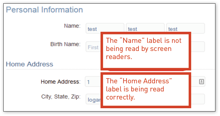
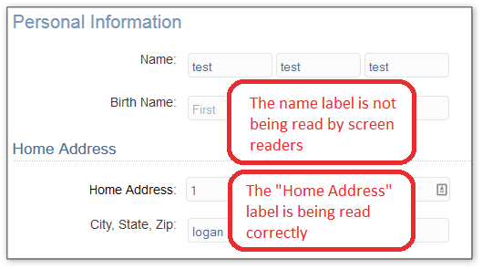
For example, Utah’s form was inconsistently coded. As a result, a screen reader is unable to read where a citizen’s name should go, even though where the address should go was coded properly. As you can see from the screen shot in Figure 1 below, it is not often clear from the look of the screen alone whether the form is accessible to screen readers.
Figure 1
In Utah’s form, the “Name” text cannot be read by a screen reader.
There were also barriers if a citizen made a mistake filling out the form. The messages that alert the user to the mistake, where it is, and what needs to be fixed were not always accessible to assistive technology, or they were difficult to find and understand.
Difficulty of Correcting
In most cases, creating a form that is accessible to screen readers is well within the skill level of the people who designed the existing sites. However, creating a form that has accessible alerts when errors occur, and an accessible means of form validation, can be tricky. Fixing these problems may require additional support.
2. Failure to Use Accessible Coding Language
(Semantic Organization)
Semantic coding, or semantic HTML, is a means of coding that reinforces the significance of any portion or text of a website. It prioritizes the headings and subheadings in order, making it easier for those who use screen readers—and everyone else, for that matter—to be able to navigate to the relevant information.
Using semantic HTML makes webpages work better with assistive technology. It provides proper heading structure, groups related items into ordered or unordered lists, uses data tables for presenting information in a tabular format, and uses proper HTML elements for controls. This is especially important for assistive technology that works with the underlying code of a website (such as screen reader software), and it also allows the website to be compatible with assistive technology that may become available in the future.
People who use screen readers have a much easier time finding relevant content in well-structured pages, but ultimately all users benefit from semantic markup.
a. Heading Structures
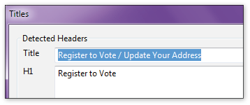
Heading structure, one of the most important aspects of a webpage, was a particular issue for the majority of states. Screen reader software reads heading structures, which allows users to jump from one heading to the next depending on what they want to read. Headings therefore not only allow users to navigate more quickly, but also provide blind users with a hierarchical representation of a page’s content. The Center for Accessible Technology reports that many people who use screen readers rate heading structure as the most critical component of a website.
Ohio’s website provides an example of the absence of HTML headings:
Figure 2
Ohio’s webpage needs HTML headings.

Best Practices
California and Utah both scored well in this category. Figure 3 provides a screen shot of California’s heading structure with the coding revealed.
Figure 3
A screenshot from California showing proper use of heading structure.

Difficulty of Correcting
It is very easy to correct poor or absent heading structures.
b. Page Titles
Unique, descriptive page titles are essential for screen reader users. It is the first item the software reads aloud on a webpage. The page title orients users within the site, lets them determine if a link they clicked on took them to the desired location, and lets them know if form submissions have resulted in errors. In addition, page titles are the default titles shown in search engines and are used when pages are bookmarked, so descriptive titles are essential for helping all users find the content.
Best Practices
Figure 4 shows a simple, clear page title from Utah: “Utah Voter Registration – Register to Vote in Utah.”
Figure 5 shows a page title from Ohio. While it tells the website user that he or she can register to vote, it neglects to tell him or her what state he or she is attempting to register in.
Figure 4
This Utah page shows how to properly title a webpage.

Figure 5
Ohio’s page title is incomplete. Without the state name included in the title, someone using a screen reader could be trying to register to vote in the wrong state.
Difficulty of Correcting
It is very easy to correct poor or absent page titles.
3. Skip Navigation
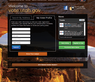
Skip navigation is an important tool for people who are unable to use a mouse and for people who use screen readers. Most websites have navigation systems with multiple links down the left side of the page and/or along the top of the page. For example, in Figure 6 below, the Kansas Secretary of State has an image at the top of the page and many links down the left side: Home, About Us, Business Filing Center, etc. Information on Registration and Voting is on the center of the page.
For sighted individuals who use a mouse, it is quick and easy to skip the links on the left, turn directly to the page content, and begin reading the desired information. But for people who navigate by keyboard or with a screen reader, they must go through the slow, tedious process of tabbing through each link on the page before getting to the main content.
Skip navigation allows them to skip all these links, just as a sighted reader can, and begin reading the page’s main content immediately.
Figure 6
The home page for the Kansas Secretary of State’s voter registration site.
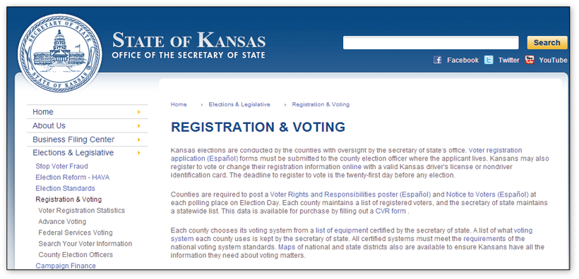
With a good navigation system, a user with a disability can efficiently get to and use the desired content.
Best Practices
Often, these skip navigation features are hidden from view until the user presses the tab key. Another method, in this case used by California, is to keep the skip navigation feature visible for all users.
Figure 7
A close-up of good use of a skip navigation link on California’s site.

Figure 8
An “activated” skip navigation link on California’s site.
California also makes it easier for keyboard users to identify when the focus has moved to the skip navigation link by having it change color.
Difficulty of Correcting
It is very easy to incorporate skip links, such as those used by California. However, it is important to place the skip links in the proper location. Ohio has tried to use skip navigation, but has placed the link incorrectly—users must scroll through all the navigation keys before getting to it, and then it does not bring the user to the main content of the page. This not only undermines the purpose of the feature, but also inadvertently makes the site less accessible.
4. Alt (Alternative) Text for Images
When websites include images, screen readers are unable to communicate the content or significance of the image to the user. Alternative text (or “alt text”) attributes are part of HTML web coding and provide a text description of the image that the screen reader can read to the user with a visual disability. The text description is usually visible while “hovering” over the image. “Alt text” allows a user with a visual disability to understand the meaning of the image.
Best Practices
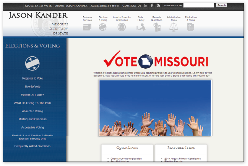
There are a number of websites with guidelines to labeling images with alt text.16 The Voter Registration website for Missouri is an example of the most common issues to consider:
Figure 9
Missouri’s Voter Registration page.
Mistakes to Avoid
Figure 10, which displays the normally hidden alt text, illustrates a common problem that occurs when a web designer does not understand the purpose of an accessibility enhancement. The link to “Accessibility Info” is an image and has been given an alt attribute. Unfortunately, this—as well as the majority of other images in that section of the page—has been labeled “Missouri Secretary of State.” A person using a screen reader on that portion of the website would not be able to identify the “Accessibility Info” link. Instead, the user would hear “Missouri Secretary of State, Missouri Secretary of State, Missouri Secretary of State, Missouri Secretary of State…”
Figure 10
Incorrect use of the alt attribute on the Missouri site.

Figure 11
Correct use of an alt attribute on the Minnesota site.

In the image above, the alt attribute correctly describes the image and helps the user make sure that they are at the correct site.
Difficulty of Correcting
As a technical matter, adding alt attributes or word labels to images is very simple. To do this well involves a combination of common sense and an understanding of how screen readers function on a website. The programmer must work to convey the right amount of information and consider the relation of the image to nearby content.
5. Keyboard Accessibility
For a webpage to be accessible, all controls and content must be accessible via the keyboard using standard keystrokes.
Keyboard access is a very important aspect of web accessibility, as it affects a large number of individuals with disabilities. Users who are blind do not use a mouse, and people with other disabilities, such as quadriplegia, carpal tunnel, or Parkinson’s disease, might not be able to control a mouse or use a touchpad.
Best Practices
At the most basic level, all controls, menus, links, forms, and buttons need to be accessible via a keyboard. Users should be able to activate all controls via the tab and enter keys (to move through the page and activate page elements, respectively).
Webpage authors need to be careful not to build sites that use unconventional keystrokes or keystrokes that might interfere with assistive technology commands. Where application-specific keyboard shortcuts are necessary, it is important to ensure that they can be turned off by the user.
Difficulty of Correcting
Ensuring keyboard accessibility is well within the capabilities of the people who designed and coded the existing voter registration sites. Any problems that exist are typically the result of a single element (out of many) on a page not being keyboard accessible. Thorough testing is important to make sure that all elements on a page are accessible.
6. Color Contrast
Adequate color contrast is particularly important for people with vision impairments, seniors, and those with reading disabilities. In addition, all users benefit from higher contrast. In fact, the higher the contrast, the higher the percentage of users that will be able to read text on the site.
Both Utah and Kansas’ websites provide examples of insufficient contrast. Utah’s light blue print on a light gray background provides insufficient contrast for many readers:
Figure 12
Utah’s website shows poor color contrast.
Similarly, Kansas’ site provides too little contrast between the small, white lettering and the light blue background. Few readers would be able to read “Department of Revenue in conjunction with Secretary of State’s Office.”
Figure 13
Kansas’ website has both print that is too small and poor color contrast.

Best Practices
Level AA of the Web Content Accessibility Guidelines (WCAG) 2.0 generally provides a level of accessibility that the Center for Accessibility supports. For color contrast, however, the WCAG AAA standard is preferable.
Color contrast should be checked as early as possible in the design process. There are a number of free contrast checkers that evaluate two colors against the accepted web accessibility guidelines; CforAT recommends using the WebAIM Color Contrast Checker.
Figure 14
This is a strong example from Ohio’s website that shows good contrast between
the text and the background colors.

Difficulty of Correcting
In theory, choosing colors that have adequate contrast is quite simple. As mentioned above, there are a number of free programs that check contrast against guidelines and provide a clear pass or fail rating. We recommend involving all relevant stakeholders in the process when choosing appropriate colors.
7. Text Size and Scaling
Individuals with a range of visual impairments need to be able to increase text size without having text overlap or disappear. CforAT recommends that no default text be smaller than the equivalent of 12-point font, and that all text on a website scale to at least 200 percent of the default without disappearing or overlapping other text.
For example, Ohio’s website has a default text size for portions of the webpage that is too small for most seniors and is inaccessible to people with low vision.
Figure 15
Ohio’s website with text that is too small.

Best Practices
To meet WCAG 2.0 guidelines for text resizing, it is sufficient to rely on built-in browser zoom tools. This is significantly easier to implement than accommodating a 200-percent increase in text size, since browser zoom scales a page proportionally, while increasing only the text size causes the layout to change. However, CforAT recommends that organizations accommodate text size increases separate from browser zoom because we have found that a significant portion of low vision users:
8. Tab Order
Tab order is closely linked with keyboard accessibility. In essence, when a user presses the tab key, the cursor should move in a logical manner. A major challenge for keyboard-only users is determining where they are on the page at any given moment. One way to make the experience more accessible for keyboard users is to ensure that the tab order follows the visual order. For English-language sites, this means the tab order should go from left to right and top to bottom.
Best Practices
Appropriate tab order can be accomplished by setting the “tabindex” on every focusable element, but CforAT does not recommend this practice. Setting the “tabindex” almost always leads to code maintenance problems and frequently ends up making the user experience worse.
The best way to implement good tab order is to ensure that the source order of the code matches the visual order of the page. New content added to the page will be in the correct tab order by default, and screen reader and sighted keyboard users will have a predictable experience navigating within pages.
State-by-State Review
For individual Secretaries of State, their staff, and programmers
Reminder
This was a high-level review of the voter registration websites. CforAT did not review every page and every detail on any site. The goal was not to capture each instance of a barrier, but to find the most common ones. Thus, the findings in this section are not a full-scale audit of any site. We recommend that states work with professional access experts in designing their websites and have professional audits of their existing websites to correct errors. While correcting the errors identified in this report would go a long way to increasing a site’s accessibility, we do not recommend that any state rely solely on this report as a complete review of its website’s accessibility.
California
Table 3
California scorecard.
|
Accessibility Issue |
Pass/Fail |
Notes |
|
Forms |
Pass |
Good use of fieldsets, legends, and labels. |
|
Screen reader access |
Pass |
|
|
Semantic organization |
Pass |
|
|
Skip navigation |
Pass |
|
|
Alt text |
Pass |
|
|
Keyboard access |
Pass |
|
|
Color contrast |
Pass |
|
|
Text size and scaling |
Pass |
|
|
Tab order |
Pass |
Issues
None. The website had a high level of accessibility and usability.
Figure 16
A perfect form from California.

Note: Some elements were removed due to space constraints.
Utah
https://secure.utah.gov/voterreg/index.html;jsessionid=0603968a8d520b807cdbf55967a2
Table 4
Utah scorecard.
|
Accessibility Issue |
Pass/Fail |
Notes |
|
Forms |
Fail |
Screen reader is not able to associate some instructional text with corresponding input fields. |
|
Screen reader access |
Fail |
Unable to interpret forms. |
|
Semantic organization |
Pass |
|
|
Skip navigation |
Pass |
|
|
Alt text |
Fail |
QR code image on step 1 is missing alt text. |
|
Keyboard access |
Pass |
|
|
Color contrast |
Fail |
Blue hyperlinks on blue background. |
|
Text size and scaling |
Pass |
|
|
Tab order |
Pass |
Issues
When using a screen reader, some input fields are not correctly associated with the corresponding instructional text. For example, under “Personal Information,” the “Name” text is not read by the screen reader. This may cause confusion for some users. There are other cases where the instructional text is correctly associated with the corresponding input field (see Figure 17).
Recommendation
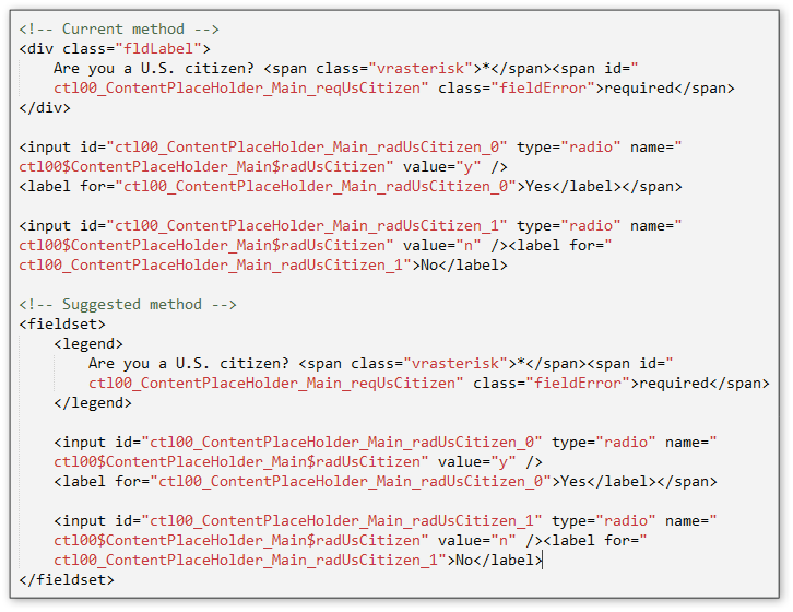
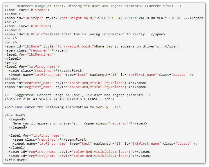
Use form fieldset and legend elements to improve accessibility. These are important features used by screen readers to associate instructional text with corresponding input fields (see Figure 21 in Minnesota analysis for a similar example).
Issues
The CAPTCHA form is missing a label for the input field.
Figure 17
The “Name” text is not read by the screen reader.
Hyperlinks on the right side of some pages do not have an acceptable contrast ratio. WCAG 2.0 AA requires a minimum contrast ratio of 3:1. This example is 2.3:1. This may be an issue for some visually impaired users (see Figure 18 below).
Figure 18
The contrast ratio is too low.
Figure 19
Form label example.

There are many more examples of incorrect use of form labels in the HTML code. The majority of these issues are unmatched “label for” and “id” values.
Minnesota
http://www.sos.state.mn.us/index.aspx?page=204
Table 5
Minnesota scorecard.
|
Accessibility Issue |
Pass/Fail |
Notes |
|
Forms |
Fail |
Screen reader is not able to associate instructional text with corresponding input fields. |
|
Screen reader access |
Fail |
Unable to interpret forms. |
|
Semantic organization |
Fail |
Incorrect use of HTML headings. |
|
Skip navigation |
Fail |
While there is a skip nav feature on the entry page, there is no skip nav on step 1. |
|
Alt text |
Pass |
|
|
Keyboard access |
Pass |
|
|
Color contrast |
Pass |
|
|
Text size and scaling |
Pass |
|
|
Tab order |
Pass |
Issues
Incorrect use of HTML headings. The <h1> element should come before the <h3> (see Figure 20).
Recommendation
Use form fieldset and legend elements to improve accessibility. These are important features used by screen readers to associate instructional text with corresponding input fields (see Figure 21). Step 1 uses labels to associate instructional text with corresponding input fields. Step 2 does not use labels at all.
Figure 20
Incorrect use of HTML headings.
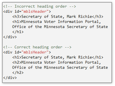
Figure 21
Example of using “fieldset” and “legend” HTML elements.
Kansas
https://www.kdor.org/voterregistration/
Table 6
Kansas scorecard.
|
Accessibility Issue |
Pass/Fail |
Notes |
|
Forms |
Fail |
Screen reader is not able to associate instructional text with corresponding input fields. |
|
Screen reader access |
Fail |
Unable to interpret forms. |
|
Semantic organization |
Fail |
Not using HTML headings. |
|
Skip navigation |
Fail |
No skip nav links. |
|
Alt text |
Fail |
No alt text in header graphic. |
|
Keyboard access |
Pass |
|
|
Color contrast |
Fail |
Header graphic has poor contrast. |
|
Text size and scaling |
Pass |
|
|
Tab order |
Pass |
Issues
Recommendation
Use form fieldset and legend elements to improve accessibility. These are important features used by screen readers to associate instructional text with corresponding input fields. One suggested approach is below (see Figure 22).
Figure 22
Incorrect form and suggested corrections.
The header image has no alt text and poor contrast (see Figure 23 below).
Figure 23
Page header image is missing alt text and has poor contrast.

Ohio
www.sos.state.oh.us/sos/upload/autoform/vrform_autoform.aspx?page=4763
Table 7
Ohio scorecard.
|
Accessibility Issue |
Pass/Fail |
Notes |
|
Forms |
Fail |
No use of labels, fieldsets, or legends. Screen readers not notified of required fields. Completely inaccessible. |
|
Screen reader access |
Fail |
Unable to complete form. |
|
Semantic organization |
Fail |
Incorrect use of HTML headings. |
|
Skip navigation |
Fail |
In use, but in the incorrect location. |
|
Alt text |
Fail |
Improper use of alt text. |
|
Keyboard access |
Fail |
When tabbing through page, there is a keyboard trap at the beginning of the form. |
|
Color contrast |
Pass |
|
|
Text size and scaling |
Fail |
Default text size too small. |
|
Tab order |
Pass |
Issues
Figure 24
Incorrect use of “alt” attribute.

Figure 25
An example of incorrect HTML headings.

Figure 26
The default text is too small.

Missouri
http://www.sos.mo.gov/elections/goVoteMissouri/register.aspx
Table 8
Missouri scorecard.
|
Accessibility Issue |
Pass/Fail |
Notes |
|
Forms |
Fail |
Incorrect use of labels. |
|
Screen reader access |
Fail |
Forms are completely inaccessible to some screen readers. |
|
Semantic organization |
Fail |
Should use HTML headings. |
|
Skip navigation |
Fail |
No skip navigation. |
|
Alt text |
Pass |
|
|
Keyboard access |
Fail |
Bypasses forms. |
|
Color contrast |
Pass |
|
|
Text size and scaling |
Fail |
Uses fixed-font “px” instead of relative-font “em” or “percentage.” |
|
Tab order |
Fail |
Bypasses forms. |
Issues
Recommendation
Use form fieldset and legend elements to improve accessibility. These are important features used by screen readers to associate instructional text with corresponding input fields (see Figure 27 below).
Figure 27
Form label example from Missouri.
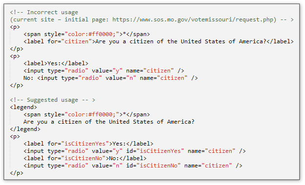
Figure 28
Additional form label example from Missouri.

There are many more examples of incorrect use of form labels in the HTML code. The majority of these issues are unmatched “label for” and “id” values.
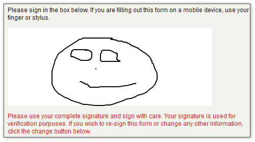
The third form screen (the sign and submit page) employs the HTML5 canvas element. This feature requires a user to use a mouse to “sign” the document. It appears that this is inaccessible to keyboard and screen reader users. The page needs to include an alternative method of submitting the form. Furthermore, this feature may be difficult for users with motor coordination impairments (see Figure 29 below).
Figure 29
An example of an inaccessible canvas feature.
Appendix A: Web Accessibility Glossary
Accessibility
The measure of a webpage’s usability by persons with one or more disabilities.
Accessibility Statement
An accessibility statement provides information about the level of web accessibility for a website and the methods used to achieve accessibility. It also enables the website owner to recognize any areas of the website where accessibility needs to improve and presents a plan for resolving any access barriers; it usually provides a contact email and/or phone number for people experiencing access issues.
Accessible Form
PDF- or HTML-based forms that allow users of adaptive technologies to access the information, field elements, and functionality required for completion and submission of a form, including all directions and cues.
Alternative Text
Textual information that describes an image on a webpage.
Assistive Technology
Any item, piece of equipment, or system—whether acquired commercially, modified, or customized—that is commonly used to increase, maintain, or improve functional capabilities of individuals with disabilities.
Focus
Where the user’s focus is on a webpage. Generally represented by a dashed box that appears around items on the page and associated with tabbing. Also referred to as keyboard focus.
Form Field
A form field is a particular box within a fillable form that requests specific information. Examples include name, address, phone number, and signature fields, multiline text boxes, radio buttons, and check boxes.
Heading Tag
In PDF and HTML, heading tags are used as structural navigation aids to help identify the order of content. Within a PDF, adaptive technologies are able to search through the document for heading tags (H1, H2, H3, H4, H5, H6) that assist with skimming a document. Most document designs should attempt to minimize the number of heading tag levels beyond Heading 3 Tag (H3), as many screen reader users do not anticipate that many levels.
HTML—HyperText Markup Language
HTML is the standard computer language for webpages. HTML elements form the building blocks of all websites. It allows images and objects to be embedded and can be used to create interactive forms. HTML uses computer “tags” that are bracketed by angles, e.g., <html>. These tags are often paired to show where an element starts and ends, such as the title of the page, paragraph, etc. It provides a means to create structured documents by denoting structural semantics for text such as headings, paragraphs, lists, links, quotes, and other items. It can embed scripts written in languages such as JavaScript, which affect the behavior of HTML webpages. A web browser “reads” the HTML files to display and interpret the webpage content. It is critical to website access, as it indicates the structure of the page—headings, links, forms, images, etc.
Semantic HTML is the use of HTML markup to reinforce the semantics, or meaning, of the information in webpages. Marking emphasis, citations, and loanwords in different ways makes it easier for web agents such as search engines and other software to ascertain the significance of the text.
Inaccessible
In the context of electronic documents and/or websites, inaccessible pertains to the difficulties an end user may face when trying to access content. Structuring that can lead to inaccessibility may include, among other things, lack of keyboard navigation, requiring the use of a mouse, small text, overlapping text, low-contrast color combinations, lack of alt text, distracting animations, or the lack of captions.
Keyboard Access
Keyboard access allows users to access each “active” element in the portal with the keyboard. Keyboard accessibility is especially important for physically impaired and blind users who cannot use a mouse. All other users will appreciate this feature, too, especially advanced users who enter mass data or laptop users.
Labels
Most web application pages contain forms that consist of labels and input elements, such as input fields. The labels are simple text elements that describe the input elements. With HTML 3.2, the World Wide Web Consortium (W3C) introduced a special label element to be used. This new element offers the advantage that an input field and its label are directly connected. The label’s attribute establishes the connection. Screen readers are then able to read the correct label whenever an input element gets the focus.
Screen Reader
Software that reads the content of a computer screen aloud. Screen readers read only text, so all graphics/images/etc. must have alternative text descriptions using alt text, captions, transcripts, or other methods. Two popular programs are NVDA (NonVisual Desktop Access), a free and open source screen reader, and JAWS (Job Access With Speech), which is produced by Freedom Scientific.
Semantic Markup
Markup (such as HTML) that describes the meaning of document elements, as opposed to their appearance. Semantic tags include headings (<h1> through <h6>), lists (<ol>, <ul>, and <dl>), <strong>, and <em>. Non-semantic tags include <div>, <font>, etc.
Skip Nav
Skip navigation allows users to “skip” to different parts of a webpage to quickly get to the content they need. The most frequent use of “skip nav” involves jumping a page’s primary content so that a user does not have to go through repetitive header, navigation, and other common content design on a site’s pages.
Tab Order/Index
An assistive technology strategy. For people who cannot use a mouse, one strategy for rapidly scanning through links, headers, list items, or other structural items in a PDF or webpage is to use the tab key to go through the items in sequence. People using screen readers—whether because they are blind or dyslexic, for example—may tab through items on a page as well as people using voice recognition can.
WCAG
The Web Content Accessibility Guidelines (WCAG) is developed through the W3C process in cooperation with individuals and organizations around the world, with a goal of providing a single shared standard for web content accessibility that meets the needs of individuals, organizations, and governments internationally. WCAG 2.0 is a stable, technical standard, easily referenced. It has 12 guidelines that are organized under four principles: perceivable, operable, understandable, and robust. For each guideline, there are testable success criteria, which are at three levels: A, AA, and AAA.
Web Accessibility
The principle that all web users should have access to information available on the Internet.
World Wide Web Consortium (W3C)
The World Wide Web Consortium is a non-profit organization founded by Tim Berners-Lee that is responsible for setting the standards for common web creation and access methods. Major documents include the specifications for the HTML and XHTML languages and the Web Content Accessibility Guidelines (WCAG).
Sources
Accessible Web Design - Joseph Dolson Web Accessibility and Development Glossary
Accessibil-IT - Accessibility Glossary http://www.accessibilit.com/about-us/
AccessibleTech.org - http://accessibletech.org/access_articles/webinfo/skipNav.php
KDE Glossary of Accessibility Related Expressions - https://accessibility.kde.org/glossary/
Keynote NetMechanic - Accessibility Dictionary
SAP - Accessibility Glossary
uiAccess - Resources on uiAccess
W3C - WAI Printable Glossary
Appendix B: States with Online Voter Registration
Table 9
|
Full Online Registration (as of June 24, 2014) |
|
Arizona: EZ Voter Registration servicearizona.com/webapp/evoter/selectLanguage |
|
California: California Online Voter Registration registertovote.ca.gov/ |
|
Colorado: Go Vote Colorado www.sos.state.co.us/voter-classic/secuRegVoterIntro.do |
|
Connecticut: Connecticut Online Voter Registration voterregistration.ct.gov/OLVR/welcome.do |
|
Delaware: I Vote Delaware ivote.de.gov/ |
|
Georgia: Georgia Online Voter Registration registertovote.sos.ga.gov/GAOLVR/#no-back-button |
|
Indiana: Indiana Online Voter Registration indianavoters.in.gov/PublicSite/OVR/Introduction.aspx |
|
Kansas: Kansas Online Voter Registration www.kdor.org/voterregistration/Default.aspx |
|
Louisiana: Geaux Vote www.sos.la.gov/ElectionsAndVoting/Pages/OnlineVoterRegistration.aspx |
|
Maryland: Maryland Online Voter Registration voterservices.elections.state.md.us/OnlineVoterRegistration/VoterType |
|
Minnesota: Register to Vote www.sos.state.mn.us/index.aspx?page=204 |
|
Missouri (only with tablet): Vote Missouri www.sos.mo.gov/elections/goVoteMissouri/register.aspx |
|
Nevada: Nevada Online Voter Registration nvsos.gov/sosvoterservices/Registration/step1.aspx |
|
New York: New York State Voter Registration Form www.elections.ny.gov/NYSBOE/download/voting/voteform_enterable.pdf |
|
Oregon: OreStar secure.sos.state.or.us/orestar/vr/register.do?lang=eng&source=SOS |
|
South Carolina: S.C. Online Voter Registration info.scvotes.sc.gov/eng/ovr/start.aspx |
|
Utah: Utah Online Voter Registration secure.utah.gov/voterreg/index.html |
|
Virginia: Virginia Voter Registration www.vote.virginia.gov/ |
|
Washington: MyVote www.sos.wa.gov/elections/myvote/ |
|
Limited Online Registration |
|
Michigan |
|
New Mexico |
|
Ohio |
Appendix C: Recommended Evaluation Criteria
Section 508 Compliance
“Section 508” refers to Section 508 of the Rehabilitation Act. In reference to web accessibility, it usually refers to the standards outlined in § 1194.22: Web-based intranet and internet information and applications. These 16 standards were developed in 1998 and were specific to the web technology at the time. While some are still applicable, many are outdated. It is possible to have a website that is “Section 508 compliant” and still has many accessibility barriers.
In addition, Section 508 is currently undergoing a “refresh” that will update it to be more relevant for today’s technology. The refresh will bring the web standards much more in line with the Web Content Accessibility Guidelines (WCAG) 2.0.
For these reasons, CforAT recommends that all clients focus their efforts primarily on meeting the WCAG 2.0 guidelines and ensuring their content works for people using today’s assistive technology.
WCAG 2.0 Conformance
The Web Content Accessibility Guidelines are designed to be much less technology-specific to account for unforeseen advances in technology. As a result, they are also more vague than the Section 508 standards. To assist website owners, designers, and developers with meeting the guidelines, there are a series of techniques described for meeting each guideline. These techniques are updated to reflect current technology.
WCAG 2.0 provides for three levels of conformance: A, AA, and AAA. Level A represents the most basic level of accessibility, while AAA is the maximum level of accessibility.
While CforAT advocates for increasing accessibility as much as possible, we recommend clients achieve AA conformance for most WCAG 2.0 guidelines, and AAA where possible. Level A conformance simply does not provide for accessible experiences, and AAA conformance can, in some cases, be cost prohibitive (though the costs would seldom be a hardship for government entities).
User Testing
Guidelines and standards are important to help web authors understand how exactly to build accessible websites. Guidelines are also immensely important in helping browser vendors, assistive technology vendors, and web developers converge on techniques that will work for users.
However, it is our strong belief that there is no substitute for testing with users. By having people with disabilities test every site we evaluate, we are able to:
The CforAT Approach
Because of CforAT’s expertise in understanding how people with disabilities use websites, they also test against their own best practices to identify ways that improve the usability of websites for people with disabilities. Their approach has been refined through years of working both with organizations trying to improve their own site’s accessibility and through their Test Bank of users who are trying to access web content every day.
Embargoed Draft
Access Denied
Barriers to Online Voter Registration
for Citizens with Disabilities
Cover photo: WorldBank/Creative Commons

NATIONAL OFFICE
125 Broad Street, 18th Floor
New York, NY 10004
(212) 549-2500
www.aclu.org
One in five people eligible to vote has a disability.

Photo: Shutterstock
The changes needed…are both inexpensive and relatively straightforward.
State and local governments must ensure they are not creating barriers…for people with disabilities.


Multiple states now provide for online voter registration.


8.1 million Americans have vision disabilities.
Photo: Thinkstock
Image: Rich Robinson
Screen readers are smart—but they are not “mind readers.”
Photo: John O’Hara/San Francisco Chronicle
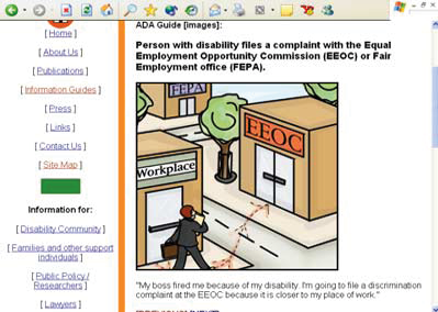

Photo: Shutterstock
State governments are, as a whole, doing an abysmal job providing accessible voter registration websites.
Very good
Good
Poor

Photo: Shutterstock
Forms are the most important portion of an online voter registration site.
All users benefit from semantic markup.
A missing “alt” attribute will cause unpredictable screen reader behavior.
Keyboard access…affects a large number of individuals with disabilities.
No default text should be smaller than a 12-point font.
When a user presses the tab key, the cursor should move in a logical manner.

Photo: Shutterstock


States with online registration websites reviewed in this report
Other states with online registration websites (as of June 24, 2014)
The name label is not being read by screen readers.
The “Home Address” label is being read correctly.
ENDNOTES
1. The American Voting Experience: Report and Recommendations of the Presidential Commission on Election Administration (Jan. 2014), available at https://www.supportthevoter.gov/files/2014/01/Amer-Voting-Exper-final-draft-01-09-14-508.pdf.
2. Washington Institute of the Study of Ethnicity and Race and Election Administration Research Center, Online Voter Registration (OLVR) Systems in Arizona and Washington: Evaluating Usage, Public Confidence and Implementation Processes 91-94 (April 2010), available at
http://www.pewtrusts.org/~/media/legacy/uploadedfiles/pcs_assets/2010/onlinevoterregpdf.pdf.
3. Pew Center on the States, “Inaccurate, Costly, and Inefficient: Evidence that America’s Voter Registration System Needs an Upgrade,” (Feb. 2012), available at http://www.pewtrusts.org/en/research-and-analysis/reports/2012/02/14/inaccurate-costly-and-inefficient-evidence-that-americas-voter-registration-system-needs-an-upgrade
4. Sarah Burd-Sharps and Patrick Guyer, Social Science Research Council. The Cost of Modernizing Voter Registration Systems: A Case Study of California and Arizona (Jan. 2014), p. 12. On file with authors.
5. Matthew W. Brault, “Current Population Reports, Americans With Disabilities: 2010” (United States Census Bureau, July 2012), available at http://www.census.gov/prod/2012pubs/p70-131.pdf.
6. 28 CFR §§ 35.130, 35.160 (a)(1) (“A public entity shall take appropriate steps to ensure that communications with applicants, participants, members of the public, and companions with disabilities are as effective as communications with others.”)
7. For a current list, see National Conference of State Legislatures, “Online Voter Registration” (Aug. 7, 2014), available at http://www.ncsl.org/research/elections-and-campaigns/electronic-or-online-voter-registration.aspx.
8. One important note: This was a high-level review of the voter registration websites. CforAT did not review every page and every detail on any site. The goal was not to capture each instance of a barrier, but to find the most common barriers. Thus, the findings in this report are not a full-scale audit of any site. We recommend that states work with professional access experts in designing their websites and have professional audits of their existing websites to correct errors. While correcting the errors identified in this report would go a long way to increasing a site’s accessibility, states should not rely on this report as a complete review of their website’s accessibility.
9. Sarah Burd-Sharps and Patrick Guyer, Social Science Research Council. The Cost of Modernizing Voter Registration Systems: A Case Study of California and Arizona (Jan. 2014). On file with authors.
10. Matthew W. Brault, “Current Population Reports, Americans With Disabilities: 2010” (United States Census Bureau, July 2012), available at http://www.census.gov/prod/2012pubs/p70-131.pdf
11. http://www.ncddr.org/products/researchexchange/v08n03/8_access.html
12. For more detail, please see Appendix C.
13. Developed by Greg Kraus at the North Carolina State University.
14. As a comparison, the Harvard Law Review has a readability score in the low 30s, while Dr. Seuss’ “Green Eggs and Ham” has a readability score of 100. A score of 60 or above is considered to be a good goal for reaching the widest audience. In this instance, due to the inherent complexity of the subject matter, we considered a score of 50 or above to be a passing grade.
15. Find the jurisdictions and languages required here: http://www.justice.gov/crt/about/vot/sec_203/2011_notice.pdf.
16. “The Rules of Alt,” available at http://html.com/images/rules-of-alt.
17. An important rule: whenever an image or <img> element is included in a page, it must be given an “alt” attribute. Even when the alt attribute is null (alt=””), it is important to include the attribute. This should not be confused with omitting the alt attribute altogether. A null alt attribute will cause screen reader software to skip the image altogether. A missing alt attribute will cause unpredictable screen reader behavior. If the alt attribute is missing, often the screen reader software will attempt to read the image filename. This can be extremely confusing for users.
here is growing consensus on the many advantages of online voter registration. For eligible voters, an online voter registration system is quick, convenient, and accurate. Access Denied: Barriers to Online Voter Registration for Citizens With Disabilities focuses on one urgent issue: the accessibility of online voter registration websites for voters with disabilities. One in five people eligible to vote has a disability. Making sure these citizens can register to vote online removes the need for a time-consuming trip to the Department of Motor Vehicles, and is also required by the Americans with Disabilities Act.
T
Photo: Thinkstock