When we first undertook the project to completely redesign ACLU.org almost two years ago, we knew we had an enormous task ahead. The site was a circa 2008 monument to the “include as much content as possible” design aesthetic – most pages were brimming with links, sidebars, tags, related items, and a multitude of paths to more content. Alas, this profusion of options made it much harder to actually find anything, and on a site with over 40,000 pages and hundreds of issue areas, making everything easy to find is critical.
To add to the (fun part) of the challenge, we also knew we wanted to reach a relatively diverse base of users, from someone who stumbled across an ACLU blog post on Reddit, to journalists, policy makers, and researchers, to online activists and advocates, to someone who found our Know Your Rights content after Googling "What to do if stopped by the police." To achieve that, we needed to make our content relevant and engaging to all of the above.
We had two other big goals.
One: Make the site mobile-friendly to ensure we’re not missing out on a new generation of smartphone and tablet users. This pursuit became even more important after Google announced that they are significantly changing their ranking algorithms on April 21, giving mobile-friendly sites higher priority in search results. That’s a big deal for the ACLU, since more than a third of of our site traffic comes in via search engines.
Two: Make the site accessible so it’s reachable and understandable to all users. That entailed a focus on supporting screen readers and other assistive technologies, color contrast, font legibility, keyboard-only navigation, and many other behind-the-scenes features. The more accessible the design, the more people can find important content and learn about their rights.
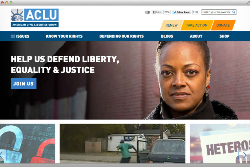
And so we set out to rebuild the site, a process that included an overhaul of the content hierarchy, taxonomy, functionality, and design. Dramatic changes were made to the overall aesthetic, with a focus on clean, readable, intuitive, and spacious design. We focused on telling the story of what drives the ACLU and what people can do to participate in a relatable, memorable way. We also made sure everything was easy to find, interesting to explore, image rich, and allowed users to learn more about our work.
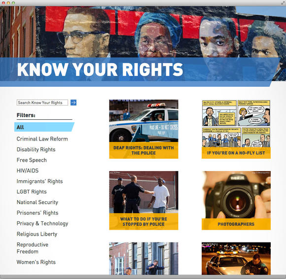
In support of this, we reorganized thousands of pages of "Know Your Rights" content, blog pages, case pages (covering our work in the courts), issue pages (detailing the issue areas we work on), feature pages, FOIA collections, and launched an online store.

ACLU.org is a window to our organization, and our design strove to incorporate key elements of the ACLU: inclusivity, fearlessness, participation, transparency, accessibility, and freedom. By creating a site that connects with these values, we hope to engage with audiences across the political spectrum who care about constitutional rights and encourage new users to join us in the fight to defend and protect civil liberties.
We’d love to hear how you think we did. Let us know in the comments!
Related Issues
Related Content
-
FloridaJul 2026

National Security
+2 Issues
Cair-foundation, Inc And Cair Florida, Inc. V. Desantis Et Al.. Explore Case.CAIR-Foundation, Inc and CAIR Florida, Inc. v. DeSantis et al.
The ACLU, the ACLU of Florida, the Southern Poverty Law Center, and their partners represent CAIR and CAIR-Florida in two federal lawsuits challenging Governor DeSantis’s unconstitutional and baseless designation of the nonprofits as “terrorist.” The lawsuits allege violations of CAIR and CAIR-Florida’s rights under the First Amendment and the due process clause of the Fourteenth Amendment. -
News & CommentaryJul 2026
Civil Liberties
The Declaration Of Independence Details “repeated Injuries” Inflicted By British Monarchy, Trump Has Executed A Similar Playbook. Explore News & Commentary.The Declaration of Independence Details “Repeated Injuries” Inflicted by British Monarchy, Trump Has Executed a Similar Playbook
The Founding Fathers declared independence from despotism 250 years ago. Today we’re fighting against similar abuses of power from a wannabe king. -
News & CommentaryJul 2026
Civil Liberties
250th Anniversary Marks Moment Of Both Commemoration And Reckoning. Explore News & Commentary.250th Anniversary Marks Moment of Both Commemoration and Reckoning
ACLU deputy executive director reflects on the country’s 250th anniversary and the work that continues today as she enters new role. -
Press ReleaseJun 2026

Human Rights
Civil Liberties
Groups Representing Plaintiffs Respond To Supreme Court Birthright Citizenship Ruling. Explore Press Release.Groups Representing Plaintiffs Respond to Supreme Court Birthright Citizenship Ruling
WASHINGTON — In a major victory, the U.S. Supreme Court today ruled that President Donald Trump’s executive order seeking to restrict birthright citizenship is unconstitutional. The American Civil Liberties Union, ACLU of New Hampshire, ACLU of Maine, ACLU of Massachusetts, Legal Defense Fund, Asian Law Caucus, and the Democracy Defenders Fund brought the successful challenge in Trump v. Barbara on behalf of children who would have been denied citizenship under the order. In its 6-to-3 decision, the court struck down the president’s 2025 executive order, which sought to strip citizenship from American children born to undocumented parents. The decision reaffirms that birthright citizenship is guaranteed by the Constitution and rejects President Trump’s attempt to redefine who is an American citizen through executive action. The following are reactions to today’s ruling: “The court’s decision reaffirms a fundamental American promise — if you are born here, you are a citizen,” said ACLU National Legal Director Cecillia Wang, who argued the case at the Supreme Court. “A president cannot change the Constitution by executive fiat. Our brave clients and our legal team stand with millions of people around our country who spoke up for one of our most cherished rights. The Constitution’s guarantee of birthright citizenship stands strong.” “With a 6-3 judgment from the U.S. Supreme Court, President Trump suffered a stunning loss on a signature order he signed on day one of his presidency,” said ACLU Executive Director Anthony D. Romero. “This was one of the most important constitutional cases of the past 100 years. The president bet his legacy trying to secure this policy win — even attending the argument in person — and he lost. It was especially gratifying that the majority opinion was authored by Chief Justice Roberts, and that Trump appointees Brett Kavanaugh and Amy Coney Barrett agreed with the decision to strike down the order.” “The Constitution, not the president, defines who is a citizen. And the 14th Amendment makes clear that every child born on U.S. soil is a citizen. Today, a narrow majority of the U.S. Supreme Court affirmed these unequivocal truths,” said Janai Nelson, president and director-counsel of the Legal Defense Fund. “We cannot and will not turn our attention away from the fact that what should have been 9-0 decision instead revealed that four justices agreed to varying degrees with the president’s desecration of the Constitution. Nor does this absolve the court of its countless decisions that have violated decades of precedent and established doctrine at the expense of Black people, communities of color, and immigrants. Nonetheless, today, we applaud this significant win.” “This is an important victory for all Americans, including Asian Americans who have been told for generations that we don't belong here, and who have been part of the fight for birthright citizenship from the start,” said Aarti Kohli, executive director of the Asian Law Caucus. “Wong Kim Ark was born just blocks from the Asian Law Caucus. We and our immigrant clients have continued the same fight for full and equal membership in this country. Today, the court reaffirmed what we've always known: We are American, and we are here to stay.” Amb. Norm Eisen (ret.), co-founder and executive chair of Democracy Defenders Fund, said, “Today’s ruling is more than a legal landmark. It is a human one. For more than a century, birthright citizenship has been a cornerstone of equal citizenship and national belonging in our country. This decision reaffirms that fundamental guarantee — no president has the power to decide who is entitled to the rights our Constitution protects. Americans’ rights cannot simply be erased by the Trump administration’s reckless executive actions.” SangYeob Kim, director of the ACLU-NH Immigrants’ Rights Project, said, “This decision is about what it means to be an American under our Constitution, and the court’s unwavering opinion makes clear that if you are born here, you are a citizen. We thank the brave immigrant parents and their children who brought this lawsuit to the highest court in the land to protect what we have long known: no politician — including the president — can decide who is worthy of citizenship. We share in their overwhelming emotions, and relief, in our fight to protect the constitutional rights for all born in our nation.” “Today's decision is a victory for immigrant families and maintains over 150 years of legal and bipartisan consensus: that at our best, America is and has always been a nation of immigrants,” said ACLU of Maine Executive Director Molly Curren Rowles. “Our cultural diversity and openness to ideas, innovation, and free expression rest on the principle of equality under the law. While we never should have had to bring this case, this decision can form the foundation of a renewed commitment to our audacious and visionary multicultural democracy.” “This ruling affirms a fundamental and inescapable principle: that everyone born in the United States is entitled to the same rights and protections,” said Carol Rose, executive director at the ACLU of Massachusetts. “Bigotry and bluster cannot change that. And the president cannot rewrite the Constitution. This ruling should make that abundantly clear. The ACLU of Massachusetts is proud to be involved in this historic case, and together with our colleagues and allies across the nation, we will continue to build on the inviolable principles of liberty, equality, and justice for all.” The Supreme Court heard oral arguments on April 1, 2026.