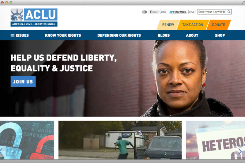
When we first undertook the project to completely redesign ACLU.org almost two years ago, we knew we had an enormous task ahead. The site was a circa 2008 monument to the “include as much content as possible” design aesthetic – most pages were brimming with links, sidebars, tags, related items, and a multitude of paths to more content. Alas, this profusion of options made it much harder to actually find anything, and on a site with over 40,000 pages and hundreds of issue areas, making everything easy to find is critical.
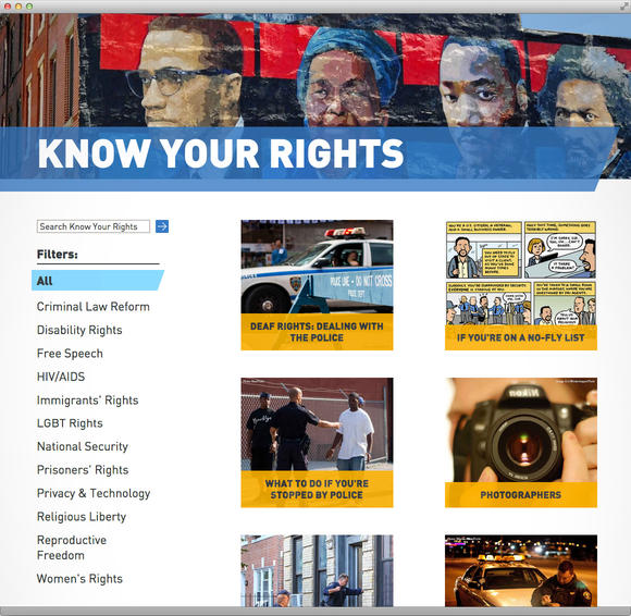
To add to the (fun part) of the challenge, we also knew we wanted to reach a relatively diverse base of users, from someone who stumbled across an ACLU blog post on Reddit, to journalists, policy makers, and researchers, to online activists and advocates, to someone who found our Know Your Rights content after Googling "What to do if stopped by the police." To achieve that, we needed to make our content relevant and engaging to all of the above.
We had two other big goals.
One: Make the site mobile-friendly to ensure we’re not missing out on a new generation of smartphone and tablet users. This pursuit became even more important after Google announced that they are significantly changing their ranking algorithms on April 21, giving mobile-friendly sites higher priority in search results. That’s a big deal for the ACLU, since more than a third of of our site traffic comes in via search engines.
Two: Make the site accessible so it’s reachable and understandable to all users. That entailed a focus on supporting screen readers and other assistive technologies, color contrast, font legibility, keyboard-only navigation, and many other behind-the-scenes features. The more accessible the design, the more people can find important content and learn about their rights.

And so we set out to rebuild the site, a process that included an overhaul of the content hierarchy, taxonomy, functionality, and design. Dramatic changes were made to the overall aesthetic, with a focus on clean, readable, intuitive, and spacious design. We focused on telling the story of what drives the ACLU and what people can do to participate in a relatable, memorable way. We also made sure everything was easy to find, interesting to explore, image rich, and allowed users to learn more about our work.
In support of this, we reorganized thousands of pages of "Know Your Rights" content, blog pages, case pages (covering our work in the courts), issue pages (detailing the issue areas we work on), feature pages, FOIA collections, and launched an online store.

ACLU.org is a window to our organization, and our design strove to incorporate key elements of the ACLU: inclusivity, fearlessness, participation, transparency, accessibility, and freedom. By creating a site that connects with these values, we hope to engage with audiences across the political spectrum who care about constitutional rights and encourage new users to join us in the fight to defend and protect civil liberties.
We’d love to hear how you think we did. Let us know in the comments!

